Original independent concept study · Fictional brief
The brief
Explore how a short positive message can become a recognisable series without repeating exactly the same layout.
Visual decisions
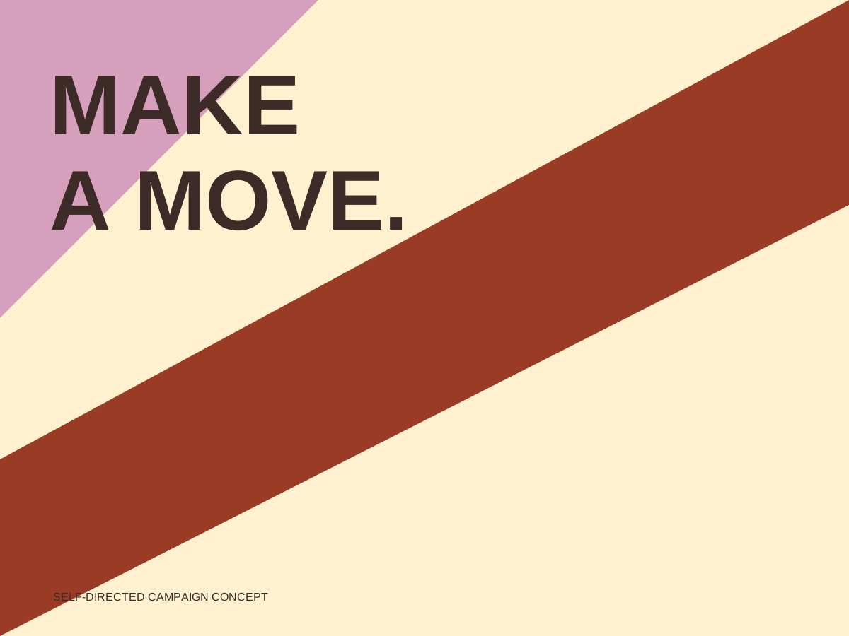
Large dark title type anchors the upper-left area. A diagonal dark red band crosses the cream field, with a smaller cream phrase set toward its lower-right end. The contrasting shapes and type sizes create movement within this single composition.
Application and scope
The study demonstrates campaign graphics. It does not claim measured engagement, advertising performance or a real programme.
For a real project, the final source material, deliverable formats, review responsibilities and usage rights would be defined in the brief. The visible study shows one bounded visual direction rather than a promise of commercial performance.